Search expectations were high
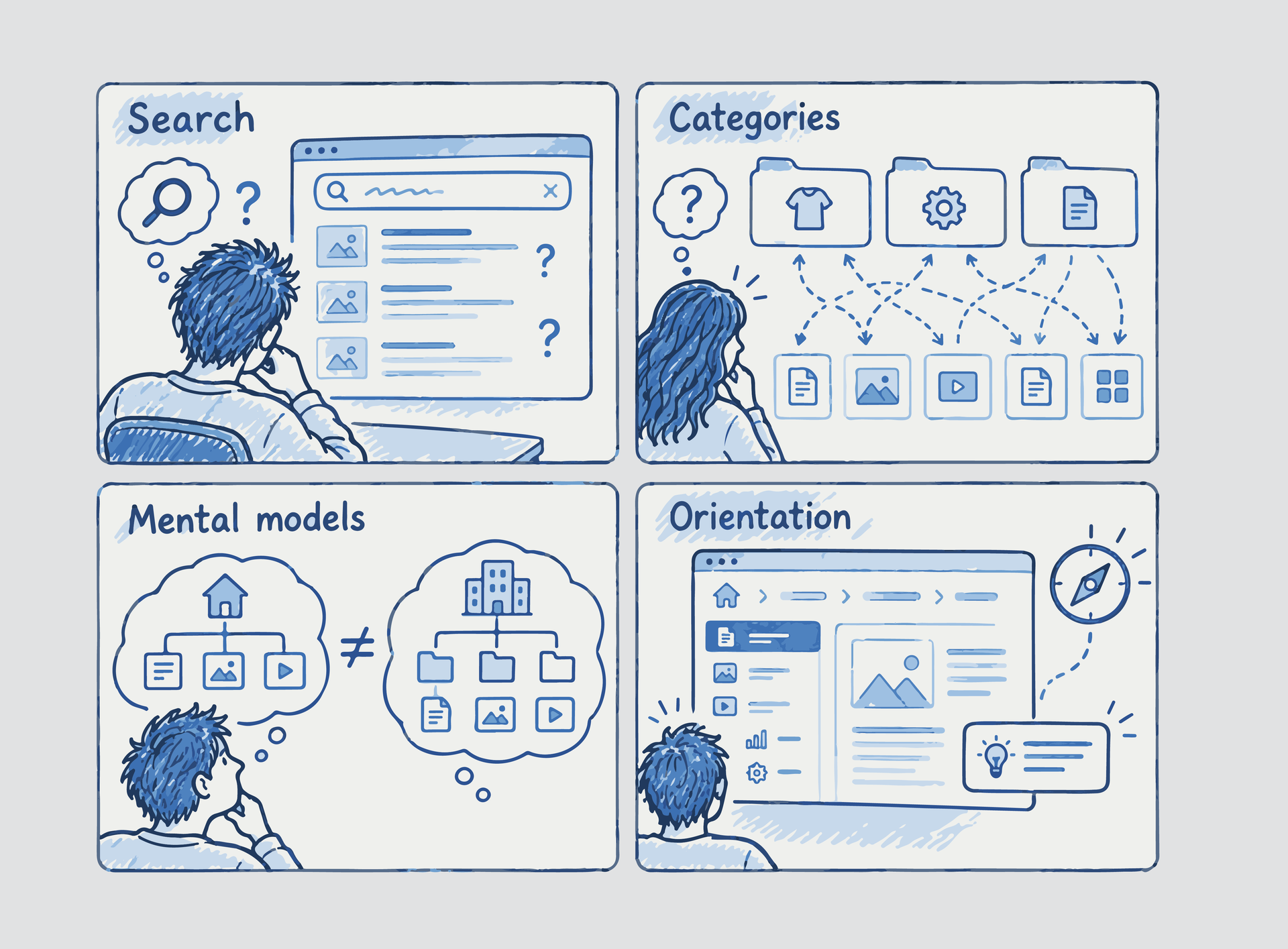
Users treated search as a primary navigation mechanism and lost confidence when it felt limited.
Enterprise fintech client
Enterprise fintech UX research
Research-driven UX improvements for complex financial platforms where terminology and structure shaped user confidence.

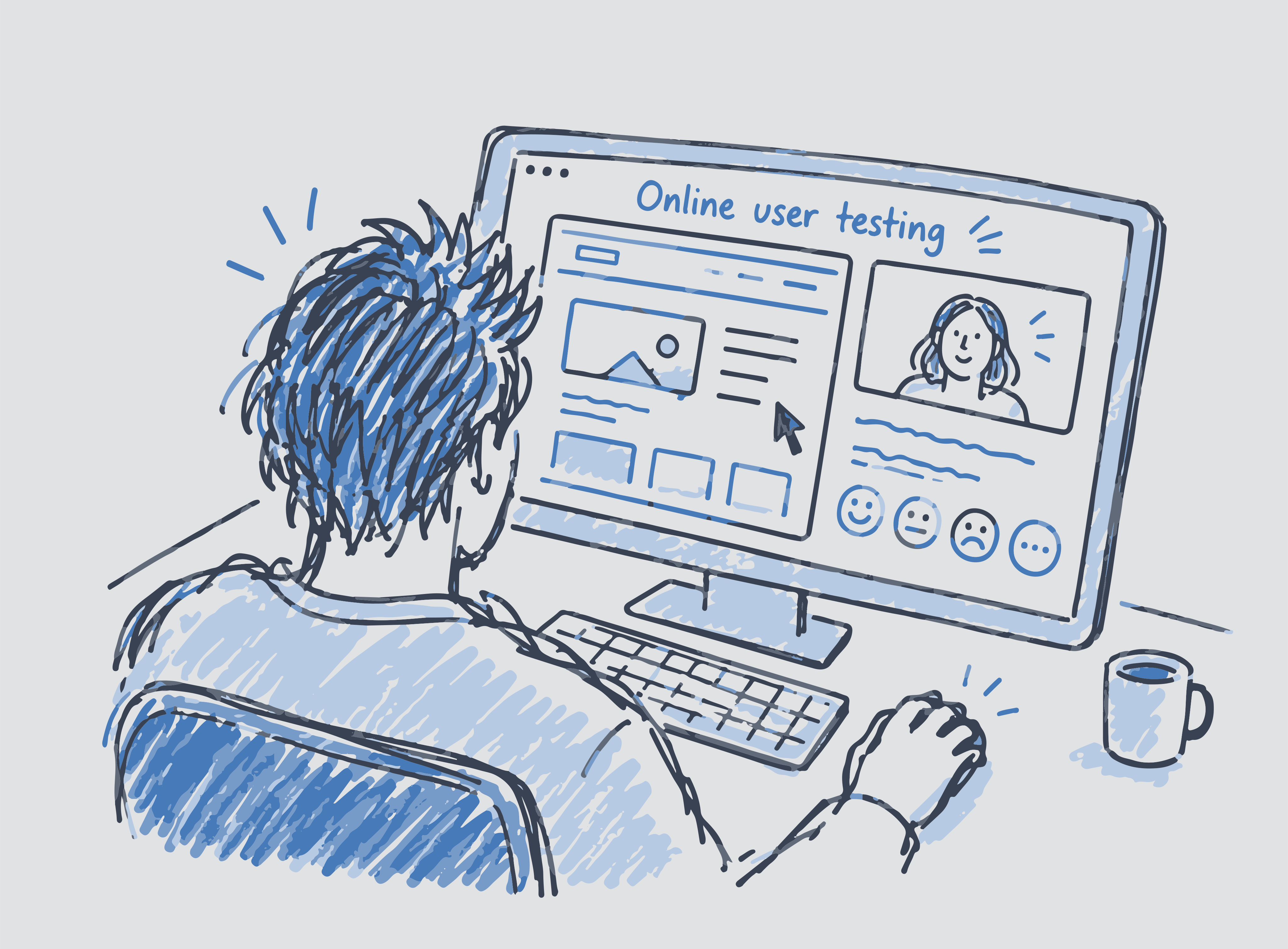
An enterprise financial platform offered substantial capability, yet users still struggled to understand its categories, interpret specialist terminology, and decide where to go next. The friction sat in the structure around the product rather than in a single screen.
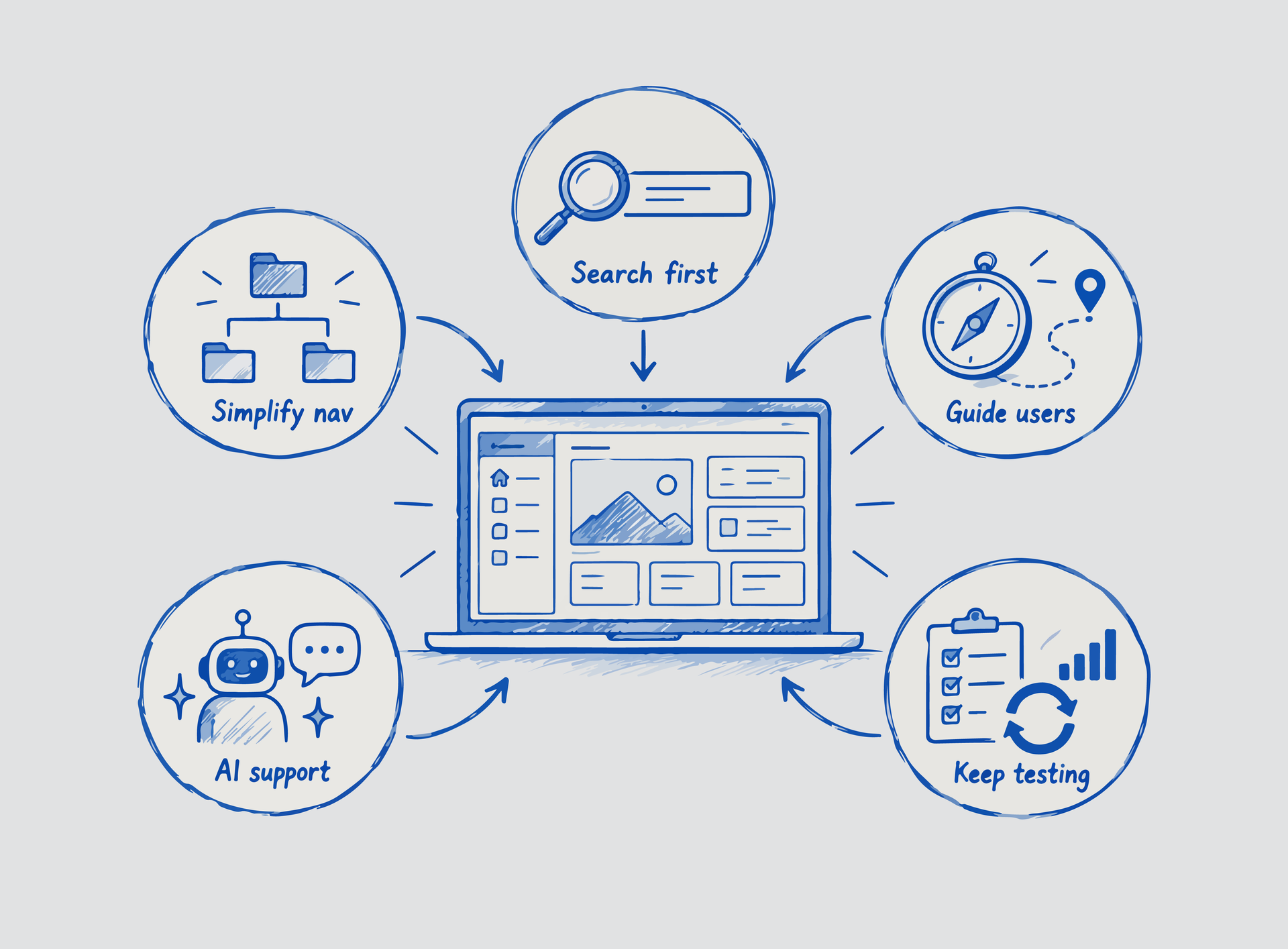
Moderated, task-based sessions traced how people searched, navigated, and formed confidence while using the platform. The findings gave stakeholders evidence for clearer labels, stronger orientation, more useful search, and continued validation.
"In fintech, users rarely struggle because the system lacks functionality. They struggle because complexity, terminology, and fragmented navigation create friction between intention and execution."
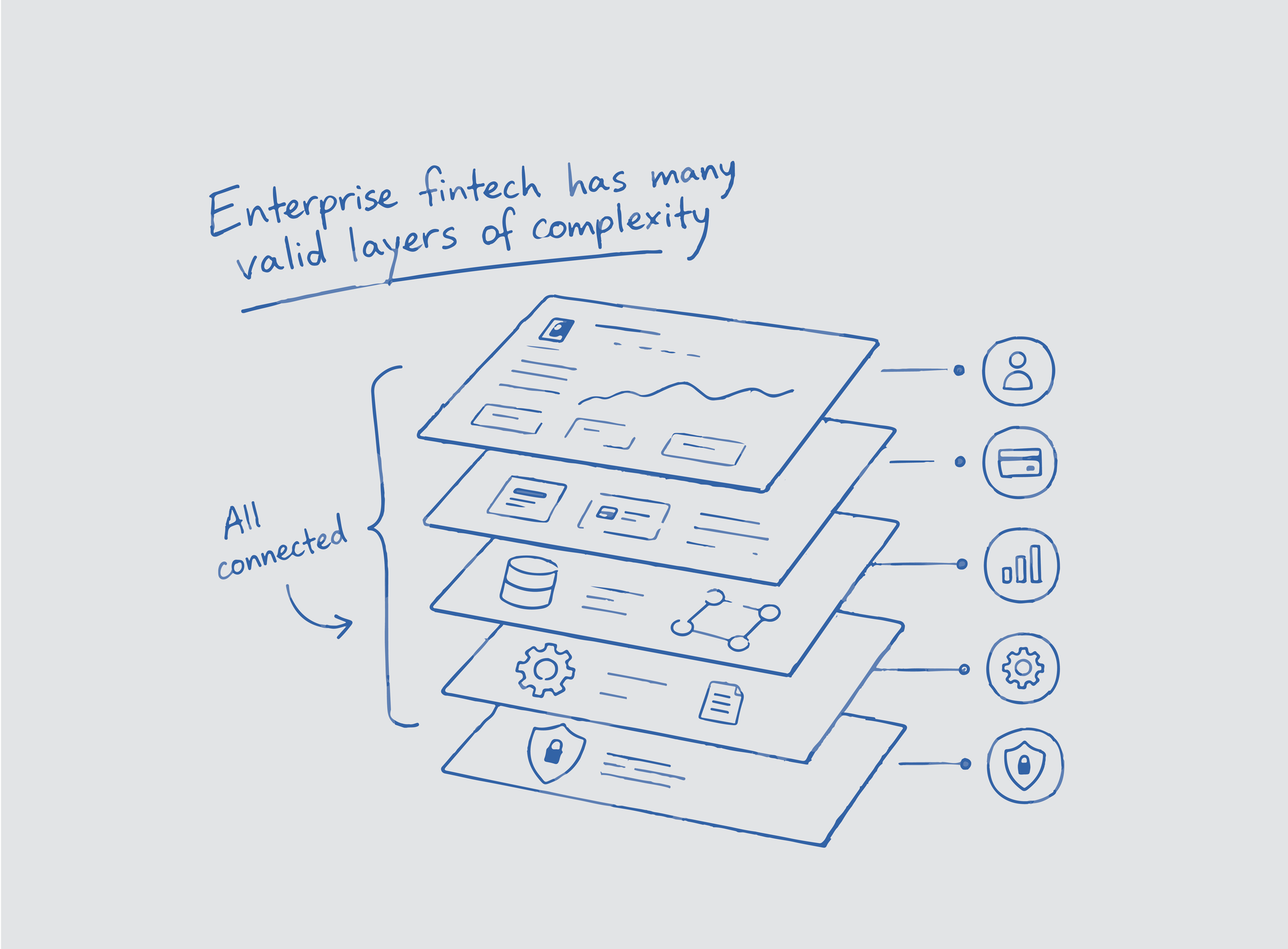
Financial platforms often contain dense information, specialized terminology, and broad service portfolios. In this project, the platform offered strong capabilities, but testing showed users struggled to confidently discover the right information and understand where to go next.
The challenge was not visual design quality. It was discoverability, clarity, information architecture, and the gap between business structure and user mental models.
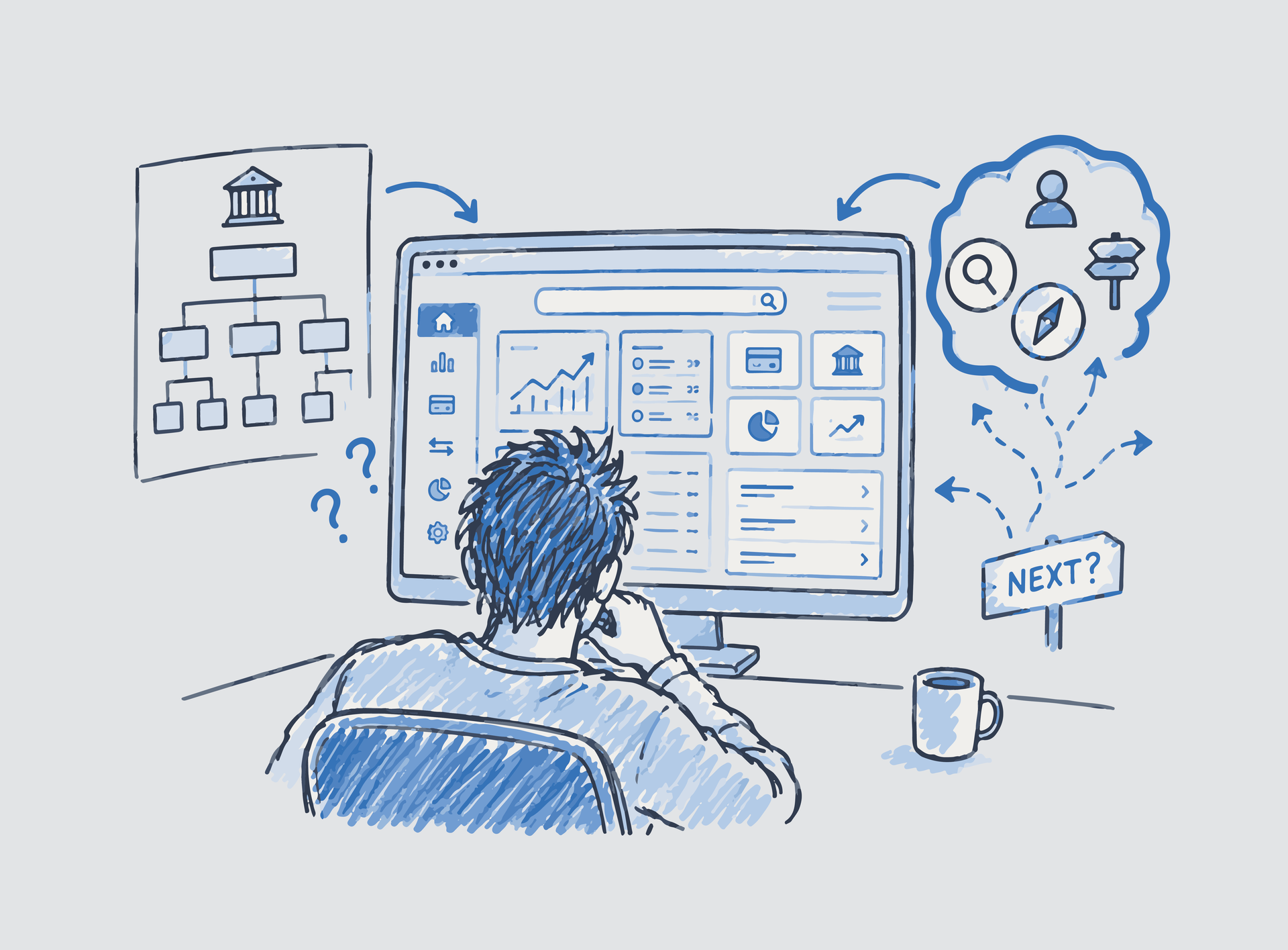
Users needed to navigate broad service portfolios, technical terminology, multiple intentions, and competing business priorities. Testing showed that users expected faster guidance when categories were broad or product pathways were unclear.
One recurring insight became central: users did not need the platform to be smaller. They needed stronger orientation signals inside a complex environment.
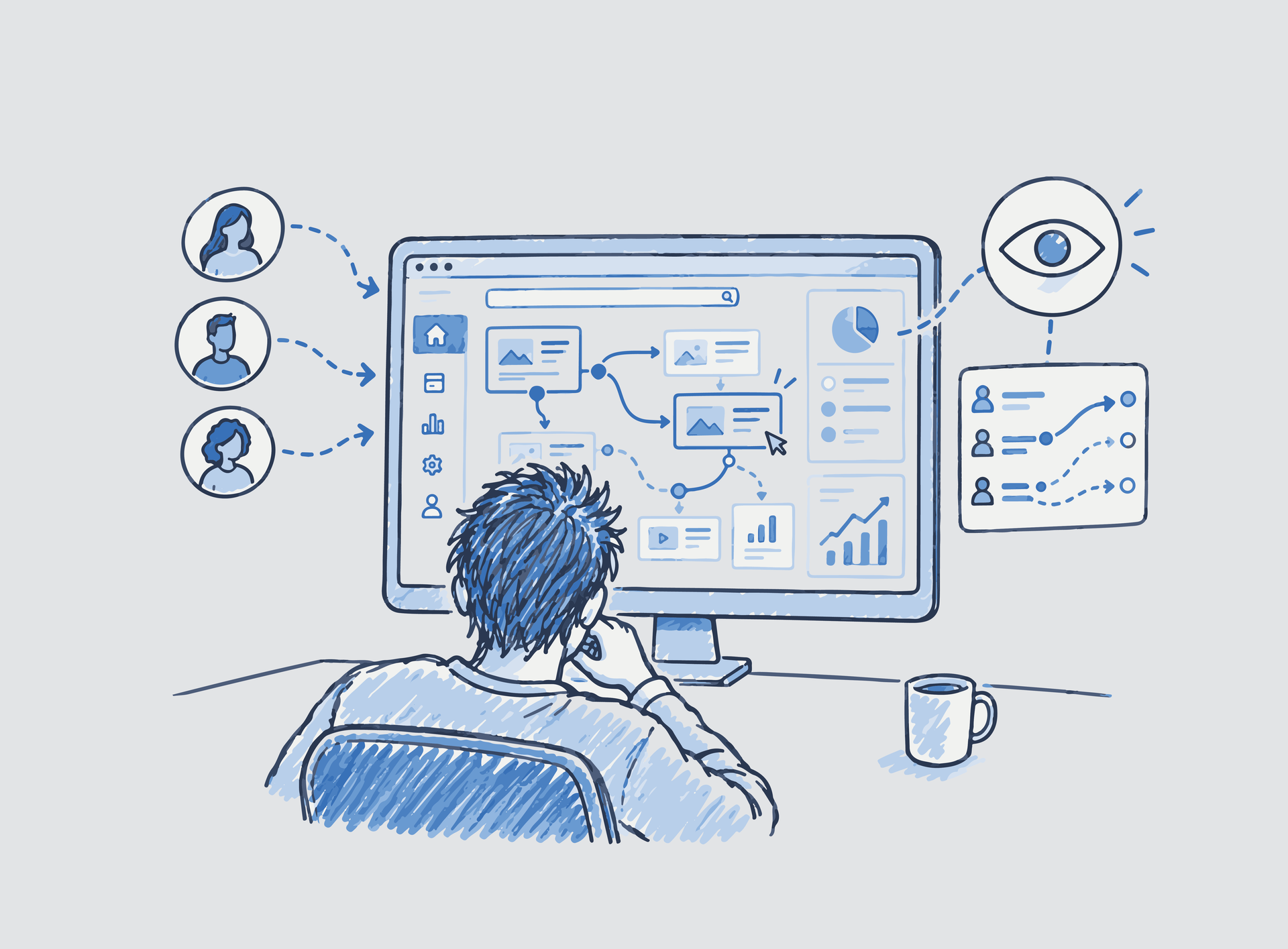
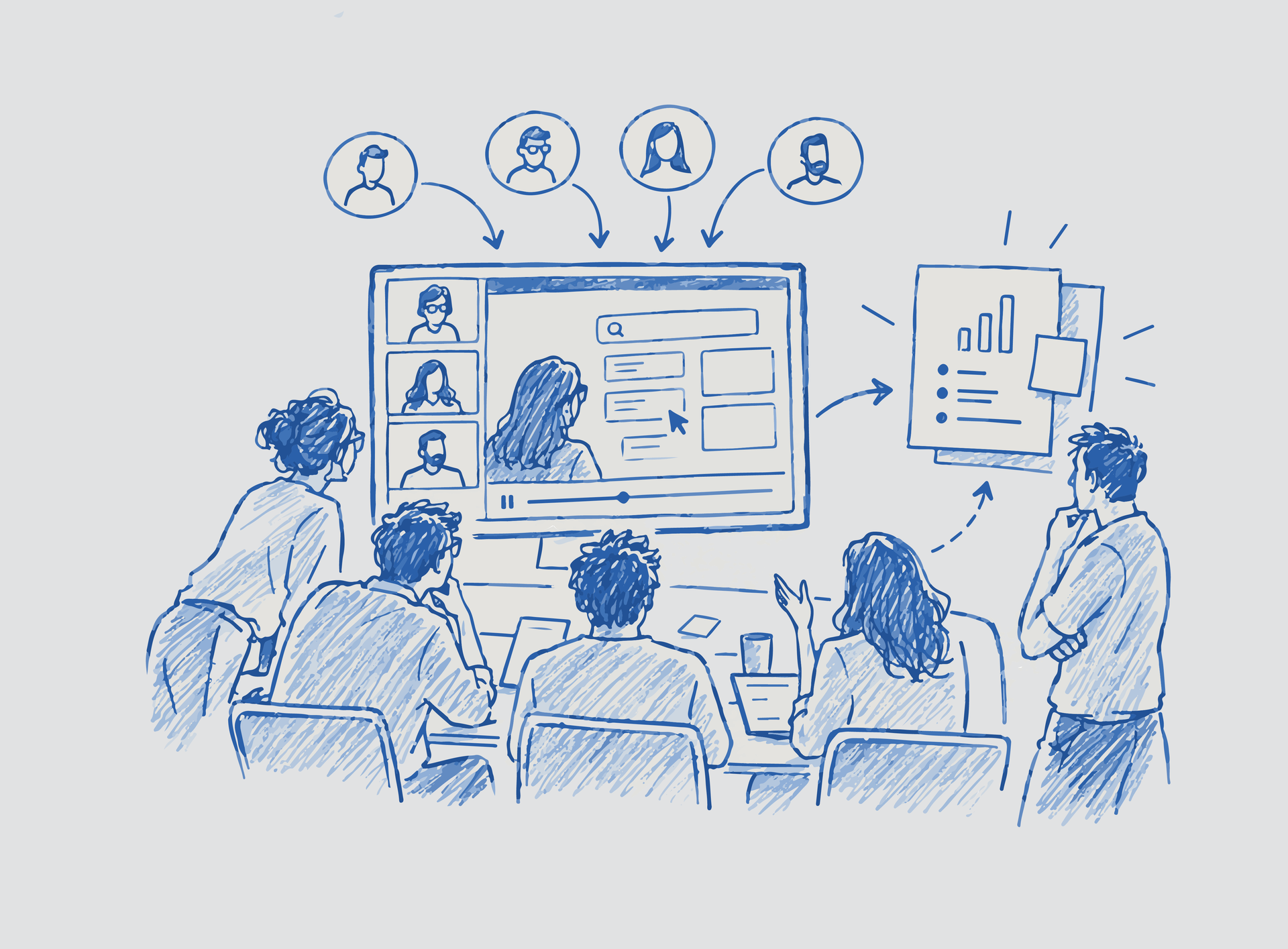
Participants were selected based on financial-domain relevance and asked to complete task-based navigation exercises, information discovery challenges, and scenario-driven workflows. The research focused on decision confidence, search behavior, comprehension, and cognitive friction across the journey.
This made the sessions less about isolated clicks and more about how users interpreted the platform as a system.
Users treated search as a primary navigation mechanism and lost confidence when it felt limited.
Some groups felt too abstract or internally focused to predict where information lived.
Users interpreted categories differently from how the business structured capabilities.
Visual cues, contextual guidance, and navigation reinforcement improved comprehension.
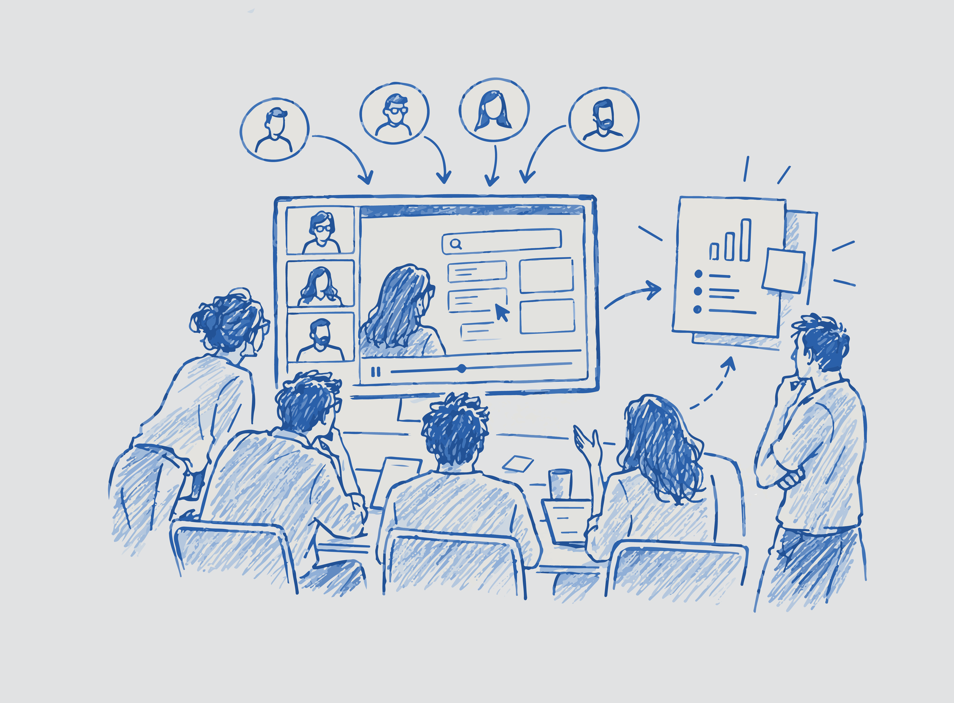
One of the most complex parts of the project was alignment. Stakeholders observed research directly, facilitators were prepared to maintain continuity, and findings were framed as shared evidence rather than isolated recommendations.
I led UX research planning, scenario development, testing facilitation, behavioral analysis, insight synthesis, and strategic recommendations. My role evolved from UX audit and competitor analysis into moderated testing and translation of findings into practical improvements.
AI-assisted synthesis workflows were also explored to accelerate insight processing and make research outcomes easier for stakeholders to operationalize.
The research gave the organization clearer evidence about how users interpreted the ecosystem, where discoverability failed, and how information architecture influenced engagement and confidence.
The recommendations created a stronger foundation for scalable UX evolution, clearer product structures, and more user-centered navigation decisions.
The work reinforced that users do not experience platforms through organizational structures. They experience them through goals, expectations, and moments of uncertainty. Designing for clarity inside complexity became the central takeaway.
This project was completed through Globant for a fintech client operating within a complex enterprise environment. Specific company details, operational metrics, and proprietary platform visuals have been generalized or omitted due to confidentiality agreements.