New users
Orientation, guidance, simplified discovery, and clearer first paths into the ecosystem.
Globant, big tech client
Enterprise information architecture
How I turned fragmented ownership and overlapping product journeys into a navigation system the organisation could govern itself.

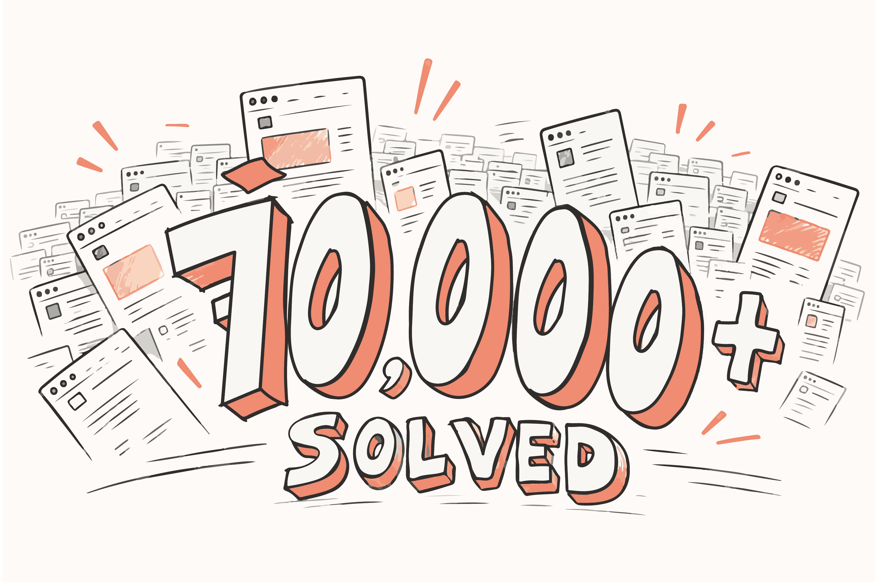
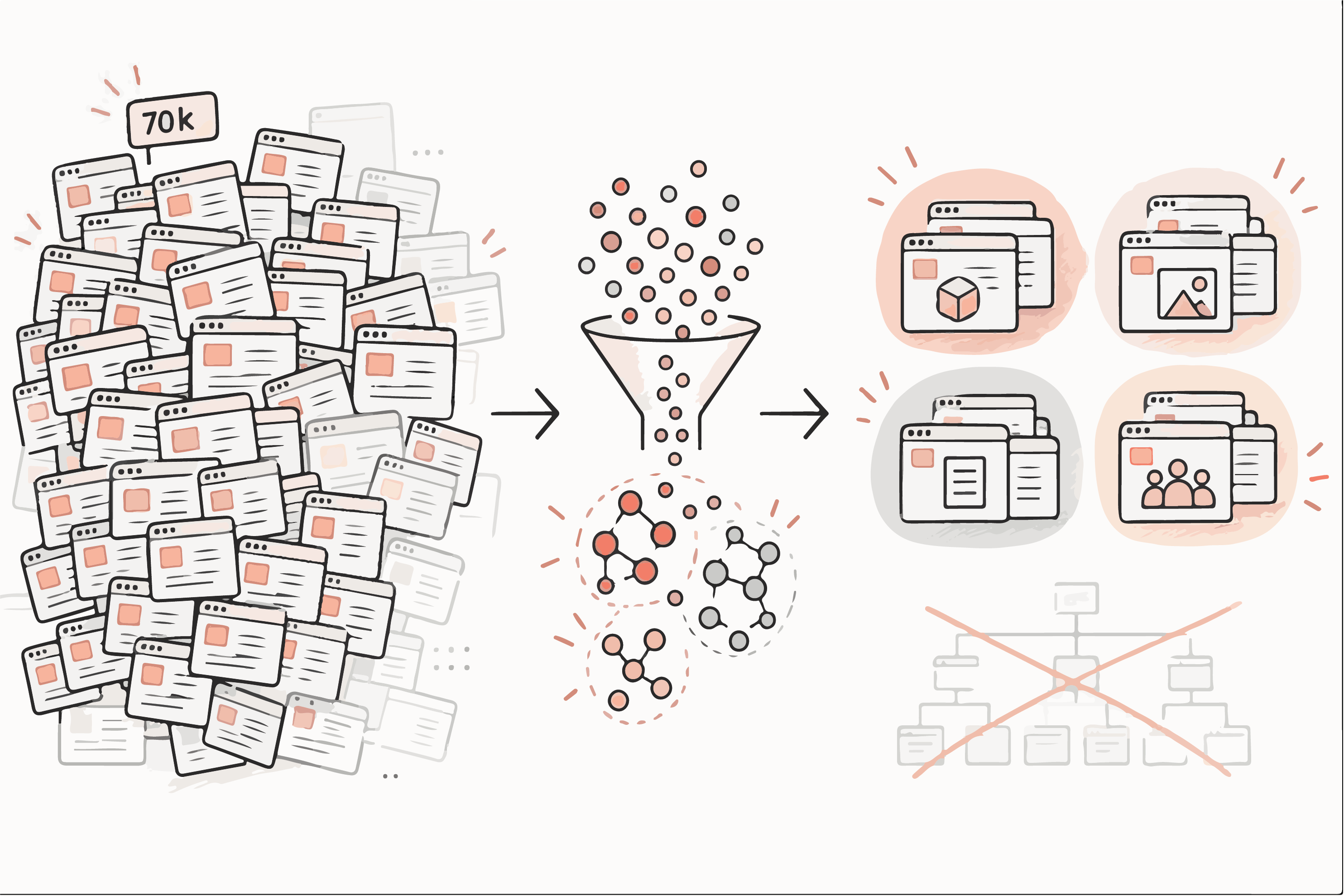
A global technology company had grown to more than 70,000 live pages across its products, departments and campaigns. No two teams gave the same answer about where a thing belonged, and customers paid for that disagreement every time they went looking for something.
The menu was the smallest part of the job. Departments with competing incentives had to settle on a handful of shared rules first, and AI read the content at a scale no manual audit could reach, so the remaining arguments were about judgement instead of inventory. What the company kept afterwards was a structure its own teams could run without me.
"Transform structured chaos into something that can be easily managed by an organization."
Every product launch and campaign had added pages, and each one had been filed by whoever happened to own it that quarter. The same product appeared under three names. Related services sat in unrelated places. Customers could not guess where anything lived because the structure recorded the company's history rather than their needs.
Reorganising that by hand would have taken a year and been stale on delivery. We needed to see the whole estate at once, get the owners to agree on a few rules, and leave behind something that stopped the sprawl returning.
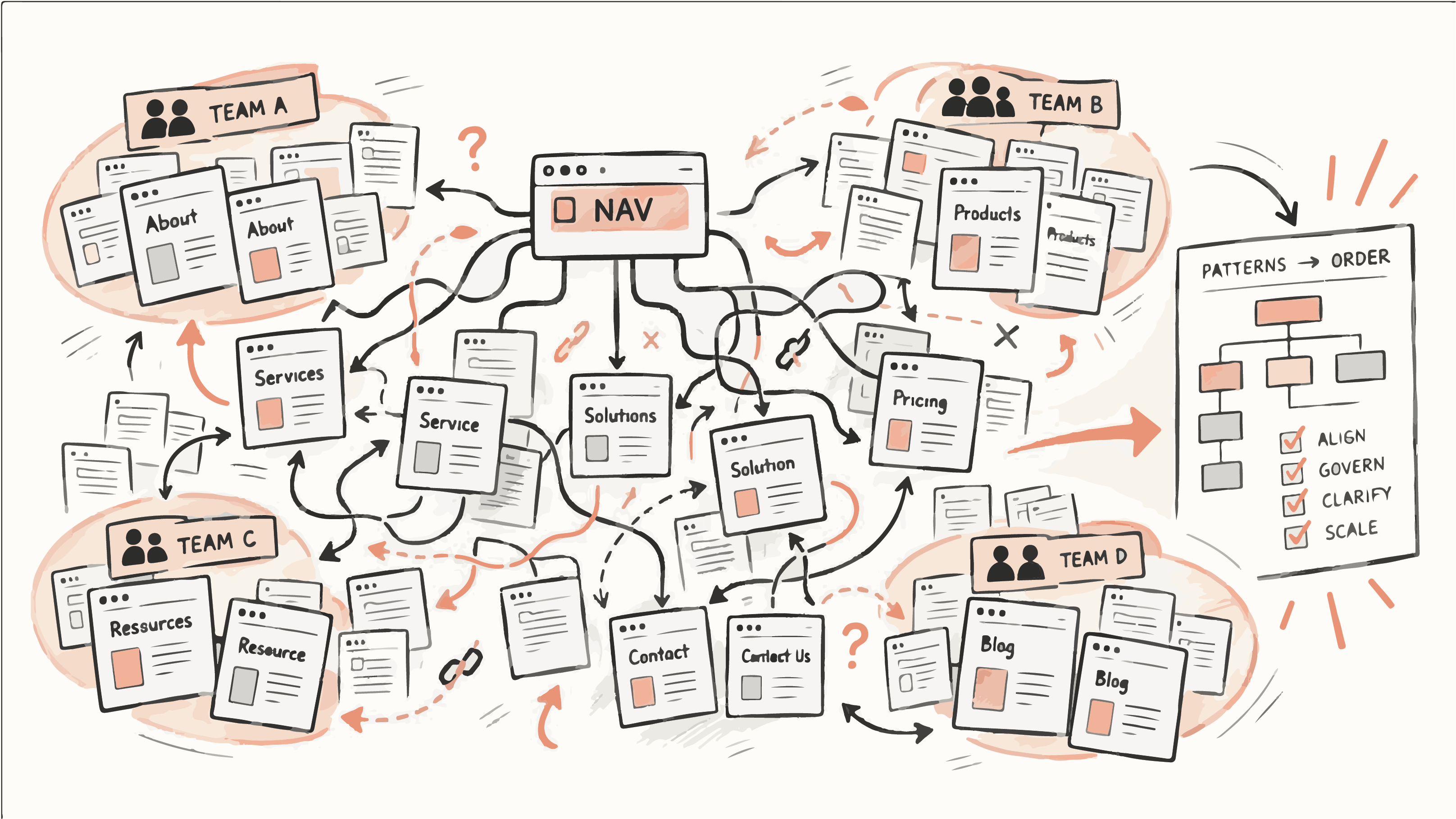
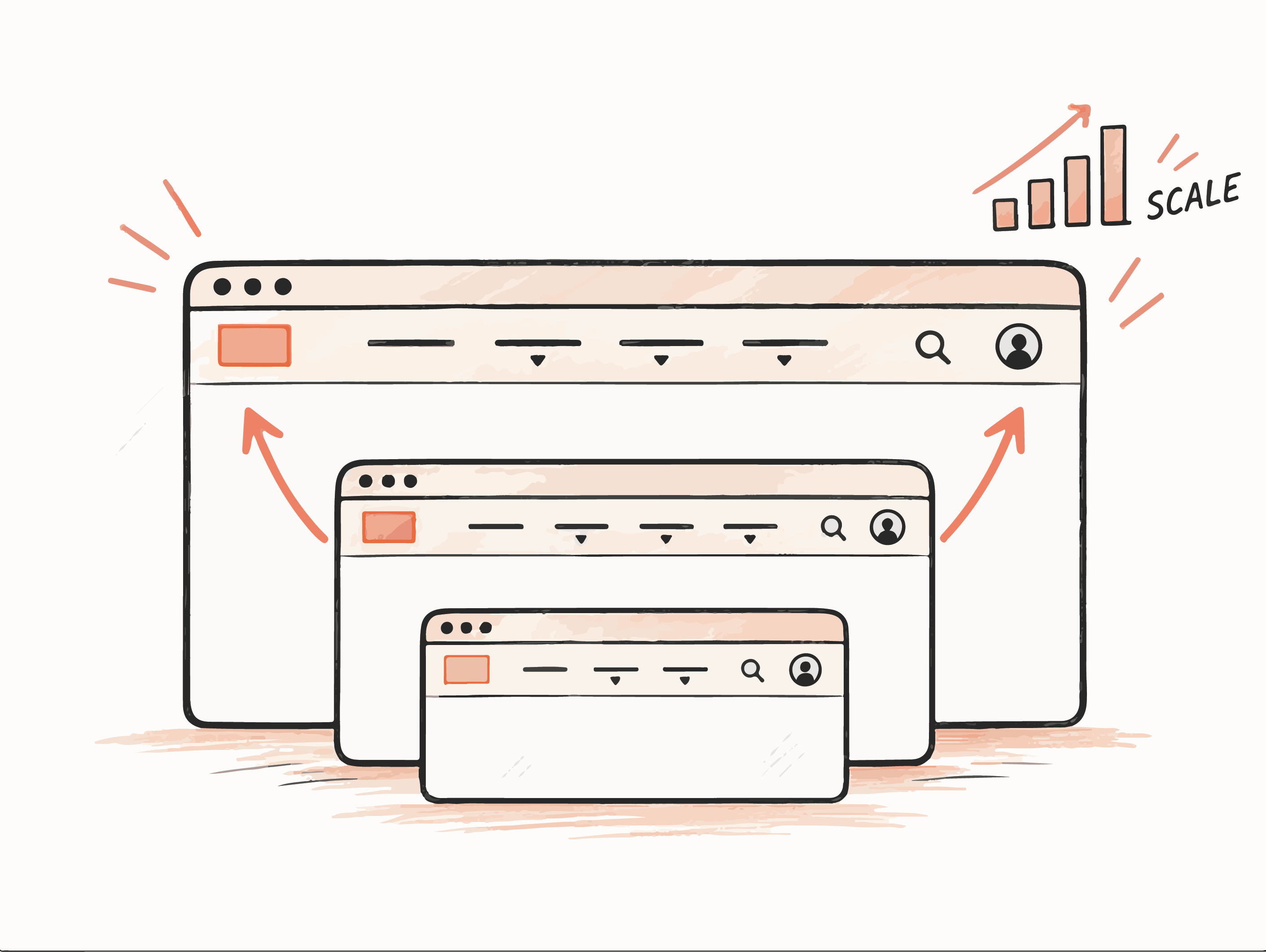
Every department wanted its own work one click from the homepage, and each had a fair reason. A recommendation that ignored those incentives would have been overridden within a quarter, so the structure had to give teams a way to settle the next disagreement themselves.
In workshops we made the trade-offs explicit and wrote them down as navigation principles with named owners and a measure attached. Once a rule existed, arguments moved from taste to evidence, and teams could apply it without calling a meeting.
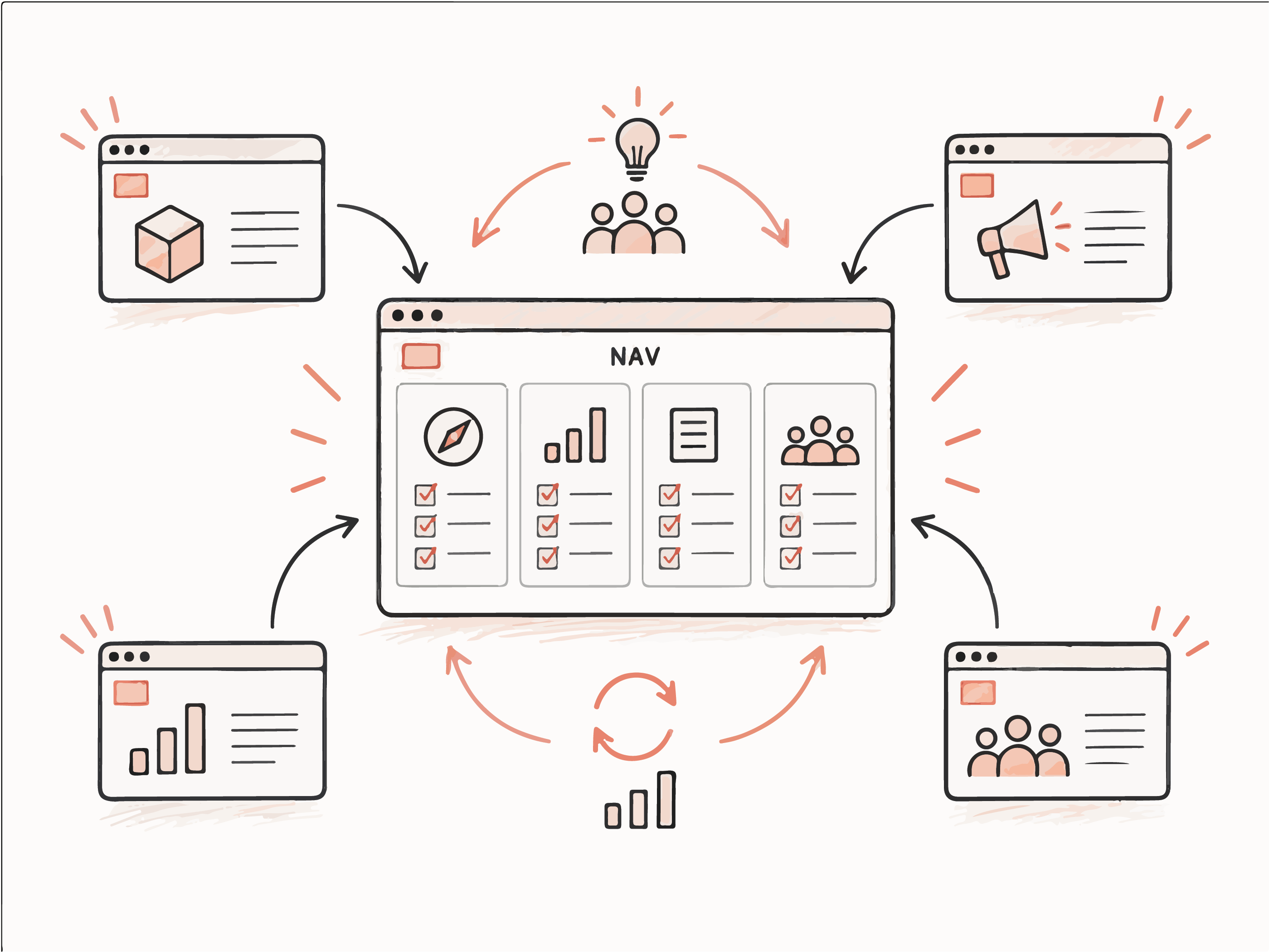
Card sorting works for a few hundred pages. At 70,000 it tells you nothing. Turning every page into a semantic embedding let us group content by what it actually said, which surfaced duplicate coverage, abandoned pages and natural clusters the org chart had hidden.
The clustering made the scale legible. It did not decide anything: every final grouping was checked against business context and signed off by the people who owned the content.
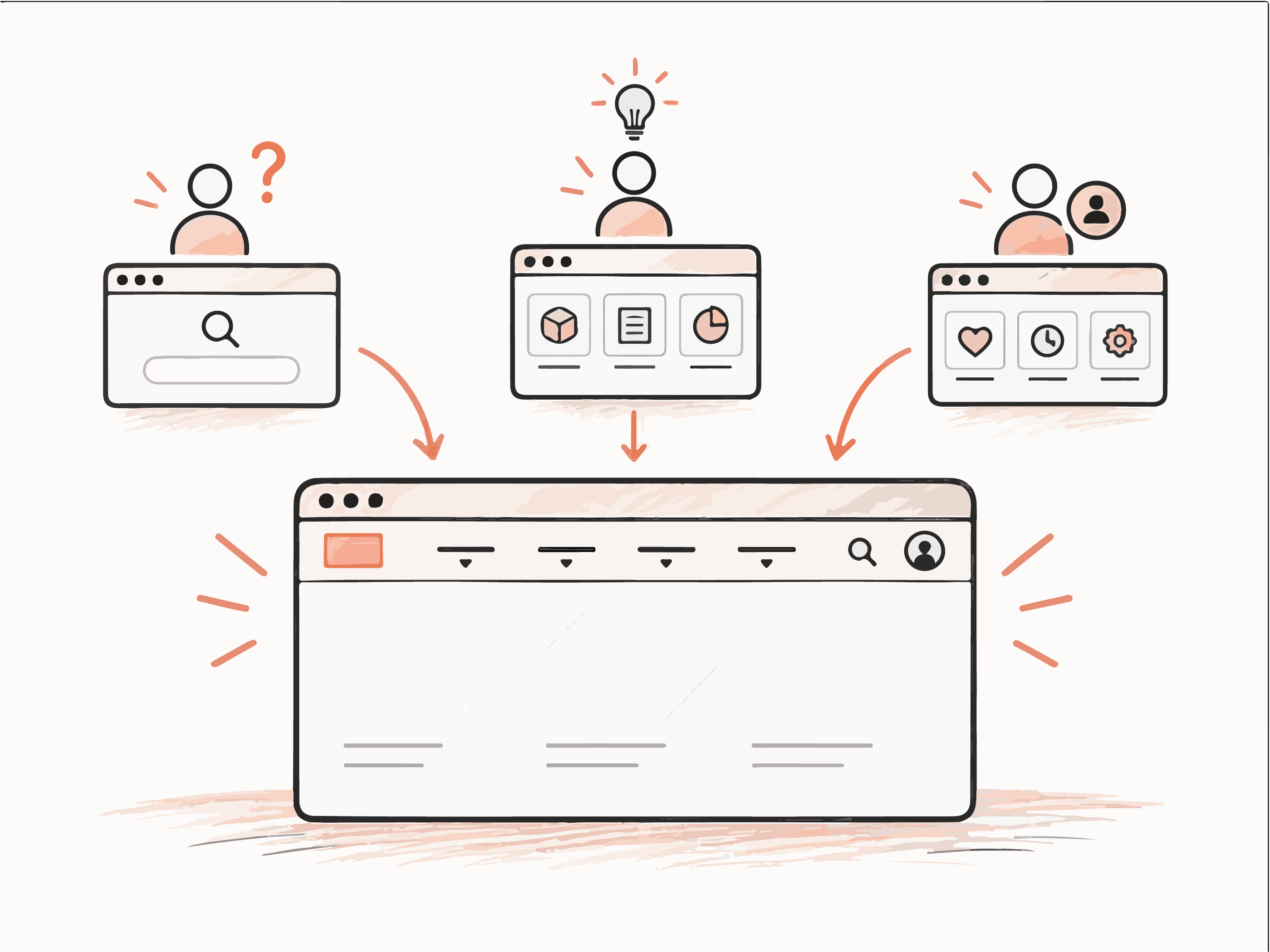
A first-time visitor and a returning account holder need different things from the same menu. We defined three levels of familiarity so the navigation could adapt later without rebuilding the taxonomy underneath it.
Orientation, guidance, simplified discovery, and clearer first paths into the ecosystem.
Device-aware navigation, localization, accessibility adjustments, and contextual recommendations.
Personalized pathways, account-aware navigation, dynamic recommendations, and tailored calls to action.
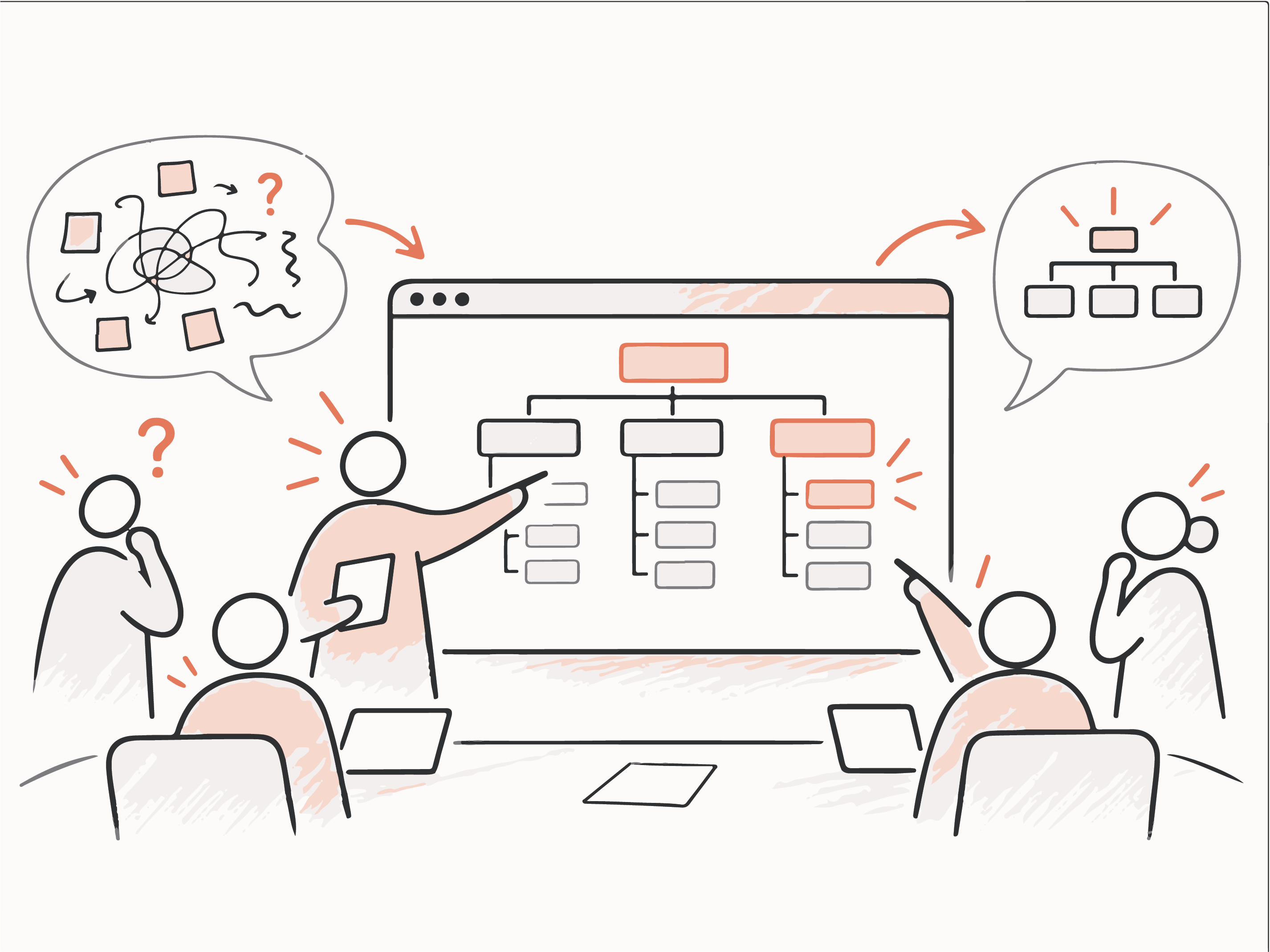
I owned the IA strategy and the taxonomy, ran the clustering workflow, and facilitated the sessions where department owners, marketing and UX had to reach a decision together.
Most of the value came from making the abstract visible. Once a taxonomy model was on screen, stakeholders stopped debating principles and started pointing at specific branches, which is when the decisions finally moved.
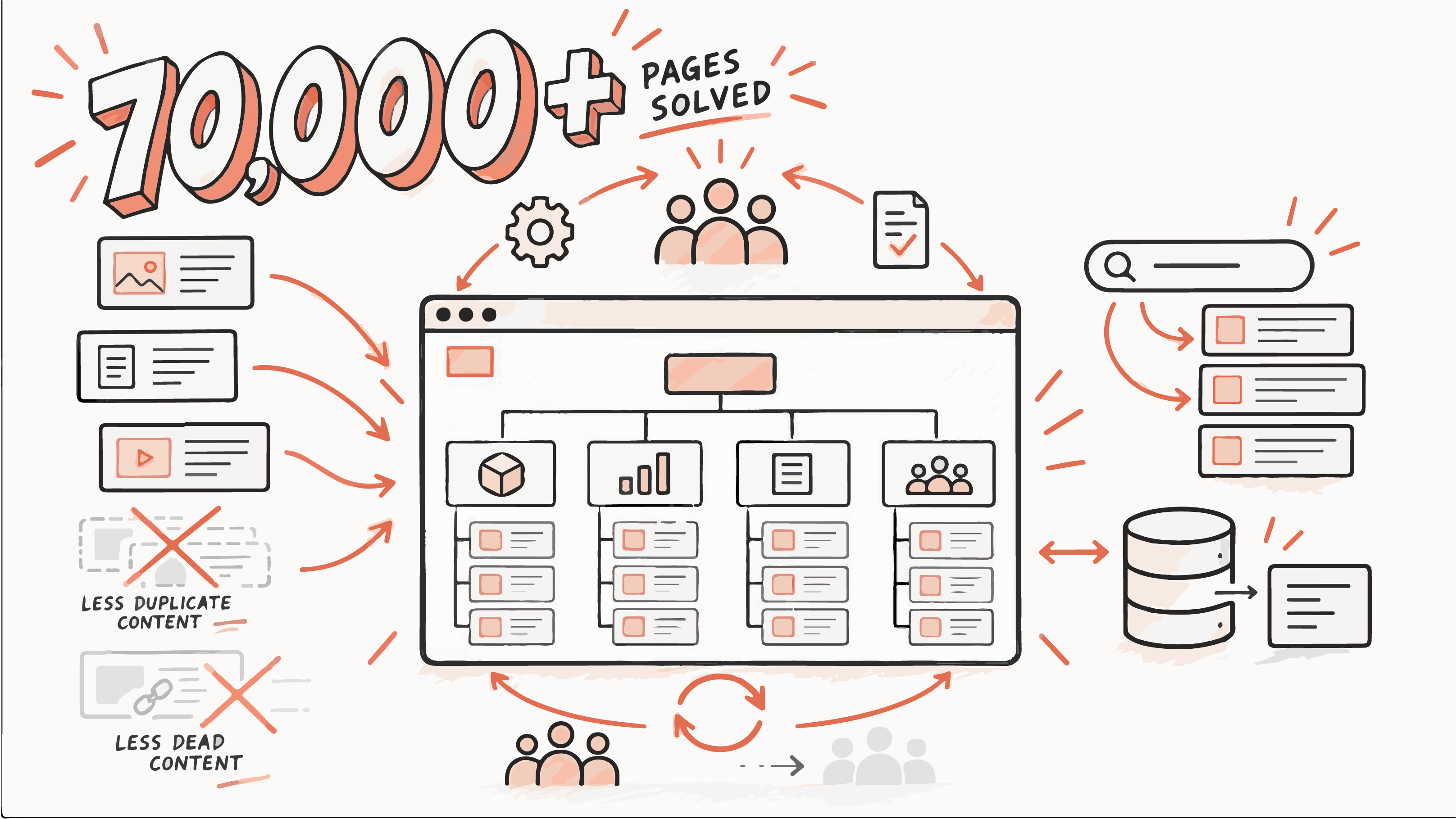
The client got a taxonomy that holds at 70,000 pages, far less duplicate and dead content, and navigation paths that follow how people actually search. It maps onto their CMS, so filing a new page is now an obvious act rather than a judgement call.
The structure will drift again as any live system does. The difference is that the company now has the rules and the owners to catch it, which is the part that keeps paying off.
Enterprise UX at this scale is mostly organisational work wearing a design brief. The hardest hour of the project was not the taxonomy. It was the workshop where two directors discovered they had been using the same word to mean different things for three years.
This project was completed through Globant and GUT for a large enterprise technology client. Due to confidentiality agreements, specific company details, metrics, and proprietary assets have been omitted or anonymized.